Python Data Visualization - Where To Start?


Episode Deep Dive
Guest Introduction and Background
Chris Moffitt is a seasoned data enthusiast and Python developer with a strong background in business-focused analytics. He works in the medical device industry, leveraging Python to build forecasting tools and analyze data beyond the limitations of Excel. Chris also runs the blog Practical Business Python, where he shares tips, tutorials, and insights on Python’s data stack for real-world use cases. He’s previously appeared on Talk Python to Me discussing ways to leverage Python instead of Excel for data analysis, and in this episode, Chris returns to share practical tips and guidance on Python data visualization.
What to Know If You're New to Python
If you’re just getting started with Python and want to get the most out of this discussion on data visualization, here are a few quick pointers:
- Basic Python Syntax: Familiarize yourself with importing libraries, calling functions, and using objects.
- Working in Notebooks: Experiment with Jupyter or VS Code notebooks to see quick plots via
df.plot()ormatplotlib.pyplot. - Installing Packages: Use
piporcondato install visualization libraries like Matplotlib, Seaborn, Plotly, or Altair for your projects. - Pandas 101: Understanding Pandas data frames and how to load, explore, and clean data sets the stage for good visualizations.
Key Points and Takeaways
- Finding the Right Visualization Library Many newcomers struggle with the breadth of Python’s plotting libraries—Matplotlib, Seaborn, Plotly, Altair, and more. Chris emphasizes that choosing the right tool often comes down to whether you need quick static plots (Matplotlib, Seaborn), deep interactivity (Plotly, Bokeh), or a declarative approach (Altair).
- Why Matplotlib Is Still Relevant
Matplotlib is considered the foundation of modern Python data visualization. Even though it can appear low-level and verbose, learning its object-oriented approach helps you understand the internals of many other libraries. Matplotlib offers unparalleled customization for publication-quality charts and supports saving plots in numerous formats (PNG, SVG, PDF).
- Tools & Links
- Pandas Plotting for Quick Insights
Pandas has a built-in
.plot()API (powered by Matplotlib) for a quick look at your data. It requires little Python knowledge, making it a great option when you just need a histogram or a simple line chart. For more specific visualizations, you can still tap into the underlying Matplotlib API or switch to libraries like Seaborn or Plotly.- Tools & Links
- Seaborn for Statistical Plots
Seaborn builds on top of Matplotlib and specializes in statistical data visualization with concise syntax and sleek styling. It offers advanced plots like pair plots, box plots, heatmaps, and more, often just a single function call away. This makes it ideal for exploring relationships, distributions, and correlations in data.
- Tools & Links
- Altair for a Declarative Approach
Altair (based on Vega-Lite) focuses on a “declarative” style, where you specify the relationship of your data rather than manually building each plot element. This style can lead to more readable code and easy interactive features like custom tooltips, hover effects, and selection-based highlighting.
- Tools & Links
- Plotly for Interactivity and Specialized Charts
Plotly offers powerful, interactive visualizations out of the box with minimal setup. Tree maps, sunburst charts, and map-based plots can all be created with just a few lines of code. Because of its JavaScript foundation, you can zoom, pan, hover, and slice data right in the notebook or your web browser.
- Tools & Links
- Streamlit for Quick Dashboards
When you need fast, interactive dashboards with minimal overhead, Streamlit is a top choice. It builds on a procedural script style: you write Python top-to-bottom, define interactive elements like sliders or checkboxes, and Streamlit handles the web app logic for you—no JavaScript required.
- Tools & Links
- Dash for Rich, Production-Grade Apps
Dash (from Plotly) is another powerful framework to build fully interactive dashboards, often integrating with real-time data. It requires a bit more code and a deeper understanding of callbacks, layout, and deployment but can result in polished, enterprise-ready applications.
- Tools & Links
- Iterative Development and Customization A recurring theme is that visualizations start simple and evolve. You might create a quick Altair or Seaborn plot, then iterate by adding color encoding, custom tooltips, or by refining the style. Each small change, like rotating the x-axis labels or adjusting tick formatters, can substantially clarify your message.
- Practical Business Applications Chris shared how he uses Python data visualization in a business context, such as forecasting models and operational dashboards. He emphasized that Python solutions are repeatable and can handle larger datasets compared to doing the same work in Excel. This underscores how even a small Python automation script can save hours of manual labor each week.
Interesting Quotes and Stories
"What does the Python tool say?" – Chris describes how colleagues often refer to his forecasting script as “the Python tool,” highlighting how Python-based solutions can become a go-to system for data insight in non-software organizations.
“Sometimes I'll Google a question and find my own article.” – Chris admits writing up solutions so future-him has a reference when encountering the same data pitfalls or debugging moments, a reminder of the power of sharing knowledge.
Key Definitions and Terms
- Declarative Visualization: A style where you describe what you want to plot rather than how to plot it step-by-step (e.g., Altair).
- Faceting: Splitting data into multiple panels based on a categorical variable (often used in Seaborn with
FacetGridor Altair’s row/column encoding). - JSON-based Visuals: Altair transforms data into JSON under the hood for Vega-Lite, enabling easy interactive features in the browser.
- Tree Map / Sunburst: Specialized chart types for hierarchical data, supported by Plotly.
Learning Resources
Below are some additional places to solidify your understanding and broaden your Python skills:
- Python Data Visualization (Talk Python Course): Deep dive into plotting with Python. Taught by Chris Moffitt, it covers Matplotlib, Seaborn, Plotly, Altair, and more.
- Move from Excel to Python with Pandas (Talk Python Course): If you’re looking to break free of Excel’s limitations, this course can accelerate your transition.
- Python for Absolute Beginners (Talk Python Course): Perfect if you want a gentle start and to build a strong foundation in Python before diving deep into data analysis or visualization.
- Chris’s Practical Business Python Blog: Tutorials, articles, and tips on real-world Python data tasks, including data cleaning, visualization, and reporting.
Overall Takeaway
Python’s data visualization ecosystem might seem overwhelming, but each library—Matplotlib, Seaborn, Plotly, Altair—brings unique strengths. Whether you need simple quick plots, deeply interactive charts, or a streamlined dashboard experience, Python can do it all. Embrace iterative workflows: start with a straightforward plot, then refine your visualization to suit your audience, data size, and deployment needs. Ultimately, Python’s adaptability for business use-cases ensures you can move beyond Excel to create both beautiful and maintainable visual solutions.
Links from the show
Python Data Visualization course: talkpython.fm
10 tips to move from Excel to Python episode: talkpython.fm
Escaping Excel Hell with Python and Pandas episode: talkpython.fm
PB Python: pbpython.com
matplotlib: matplotlib.org
Seaborn example: seaborn.pydata.org
Altair: altair-viz.github.io
Plotly sunburst: plotly.com
Plotly treemap: plotly.com
streamlit: streamlit.io
Dash: dash.gallery
Streamlit Talk Python episode: talkpython.fm
splink package: github.com
redframes package: github.com
Edward Tufte book: edwardtufte.com
Watch this episode on YouTube: youtube.com
Episode #384 deep-dive: talkpython.fm/384
Episode transcripts: talkpython.fm
---== Don't be a stranger ==---
YouTube: youtube.com/@talkpython
Bluesky: @talkpython.fm
Mastodon: @talkpython@fosstodon.org
X.com: @talkpython
Michael on Bluesky: @mkennedy.codes
Michael on Mastodon: @mkennedy@fosstodon.org
Michael on X.com: @mkennedy
Episode Transcript
Collapse transcript
00:00 Do you struggle to know where to start with the wide range of Python's data visualization
00:03 frameworks? Not sure when to use Plotly versus Matplotlib versus Altair? Then this episode is
00:10 for you. We have Chris Moffitt, a Talk Python course author and founder of Practical Business Python,
00:15 back on the show to discuss getting started with Python's data visualization frameworks.
00:20 This is Talk Python To Me, episode 384, recorded September 29th, 2022.
00:26 Welcome to Talk Python To Me, a weekly podcast on Python. This is your host, Michael Kennedy.
00:44 Follow me on Twitter where I'm @mkennedy and keep up with the show and listen to past episodes
00:48 at talkpython.fm and follow the show on Twitter via at talkpython. We've started streaming most of our
00:55 episodes live on YouTube. Subscribe to our YouTube channel over at talkpython.fm/youtube to get
01:01 notified about upcoming shows and be part of that episode. This episode is sponsored by Microsoft for
01:07 Startups Founders Hub. Check them out at talkpython.fm/founders hub to get early support for your
01:14 startup. And it's brought to you by us over at Talk Python Training. Did you know we have one of the
01:20 largest course libraries for Python courses? They're all available without a subscription. So check it
01:26 out over at talkpython.fm. Just click on courses. Transcripts for this episode are sponsored by
01:32 Assembly AI, the API platform for state-of-the-art AI models that automatically transcribe and understand
01:39 audio data at a large scale. To learn more, visit talkpython.fm/assembly AI. Chris, welcome back to
01:47 Talk Python To Me. Thank you. Glad to be here again. I'm glad to have you back. We originally
01:52 had you on to talk about the work that you're doing at Practical Business Python. And looking at the page
01:59 now, your last article, pandas group by warning on the 26th, which as of recording, two days ago,
02:05 looks like you're still really active on Practical Business Python. I am. It's been a while. To be honest,
02:11 I spent a lot of time working on the course that we'll talk about in a moment. And so some of this
02:15 stuff fell by the wayside. And I think like everybody in the COVID times have been a weird
02:20 time warp for us all. So I haven't spent as much time on it as I would like, but I am getting back
02:26 into it. And as you mentioned, just put a short article up there that in some ways kind of encapsulates
02:33 a lot of what I want to do with Practical Business Python is I'm writing in this specific article in general
02:38 on the blog about problems that I encounter that I think can help other people. And this was a short
02:45 article about some kind of gotcha behavior with group by that I've been bitten by a couple times.
02:51 And this most recent time, I decided, you know what, I need to write about this and share it with people
02:57 so that hopefully they're not going to fall into the same traps that I had.
03:00 I love when you write something as kind of a note for yourself or a roadmap for yourself. And then
03:05 later you go back and you search for it. And you're like, I got to remember how this went.
03:10 And like hit number one as your result. You're like, okay, I guess I don't remember this,
03:15 but I'm going back to it. And I, you know, my future self thanks my old self for it, right?
03:19 Yes, exactly. And sometimes I even remember I wrote an article about it and will refer to it.
03:24 And then a lot of times you're right. I'll do a Google search. I'm like, oh yeah,
03:27 I did solve that before.
03:30 How interesting. Yeah, cool. What a great resource. People should be definitely checking
03:34 this out. If you know, you want to do data science, Python data science intersected with
03:38 Python. Of course you were on the show a couple of times ago, way back on 2019 and the before times
03:44 escaping Excel hell with Python and Pandas. Basically you were making the case for
03:49 using the Python data science stack instead of Excel, right?
03:53 Yes, absolutely. Yeah. And you know, the blog and a lot of my experience has been
03:58 doing data analysis, data manipulation, data science, and trying to leverage the power of Python.
04:05 And most people in a business setting, their go-to data science, data science tool or data analysis
04:12 tool is Excel. And it has its place. I'm not advocating we get rid of Excel, but I think there
04:18 are a lot of things that we can do with Python that are much quicker, much less error prone and
04:24 much more efficient than trying to do it in Excel. And Excel is one of those tools where there's such a
04:30 wide range of usage. There's some people that are experts and can do really complex, very efficient
04:36 things in Excel, but there's a lot of people that treat Excel like the proverbial hammer. Everything's a
04:42 nail. So you try and use Excel to do everything from data cleaning to building out your financial
04:47 statements to, I don't know, machine learning. And it's probably not really the best tool for all of
04:53 those things. I think Python really fills a nice niche and had the good fortune of using it for a
04:59 lot of different types of activities in my business career and wanted to talk about that in the podcast.
05:06 You know, one thing that occurred to me, just thinking about the code that I've seen for like
05:10 visualizing data and so on with Python compared to writing algorithms or web apps or something,
05:18 it seems to me that the amount of Python that you have to know and able to maybe import pandas,
05:24 load a CSV and then graph it, you almost hardly need to know Python at all. And it's more about
05:30 knowing the APIs of the various visualization frameworks like Mapplotlib or Seaborn, right?
05:35 No, absolutely. I agree completely. I mean, you basically need to know, like you said, how to
05:39 import and even backing up probably the most, the biggest challenge is getting Python set up on your
05:45 system, depending on the system you have and everything, getting your environments all squared
05:49 away. But once that's done, you're right. The data visualization libraries, no matter which one you
05:54 choose, essentially are knowing how to call functions.
05:57 Yeah, exactly. And they all often seem to have their own little DSL domain specific language for
06:03 what they've decided they're going to do, right?
06:05 Yes, exactly. And I think that's, you know, part of the challenge is everybody thinks a different way.
06:10 And sometimes like a library might make a lot of sense to you, but other people, it doesn't. And so
06:16 that's a lot of where I think some of the challenges in the visualization landscape are,
06:20 are trying to find that right API that makes sense for the actual business problems or
06:24 visualization problems that you have and how, how it fits in your brain.
06:28 Indeed. So if people are coming from a business perspective and maybe Excel is where they or their
06:34 colleagues have been working, I definitely recommend people go check out episode 200. And then there was
06:39 also 10 tips to move from Excel to Python, a lot of common themes here.
06:43 Yes.
06:44 So normally at the beginning of the show, I ask people how they got into programming in Python.
06:48 I've got you to answer that at least once, maybe twice, but probably a third time is,
06:54 is not required. So just give us an update on what you've been up to.
06:57 Sure. I am still working in the medical device industry. My job doesn't require Python, but my job
07:04 does involve a lot of data analysis and working with not necessarily large sets of data, but sometimes
07:10 data sets that are big enough that it's a little bit painful to work in Excel. And I just continue to
07:16 find Python as the tool that I reach for when I need to do data analysis. And I continue to use it to
07:23 build repeatable data analysis pipelines. I use it to clean data, maybe take external data that we buy
07:31 from a third party and integrate it with internal data sets, or as we'll talk about doing data
07:38 visualization. I think there are a lot of things that Python can do from a data visualization perspective
07:42 that are easier than trying to use Excel or some of the other tools that are available in a traditional
07:49 environment. So I continue to live and breathe Python. And I would say, you know, every week,
07:56 I use it a little bit, some weeks, a lot more than others, but continue to enjoy kind of that blend of
08:02 Python, real world problems, and not just for software development's sake.
08:07 Do the people you work with, since program is not officially like your title, do they look at you
08:12 as kind of like a wizard?
08:13 A little bit. Yeah.
08:14 Yeah.
08:14 They do. And I mean, I've done one of the things that I've worked on was a forecasting tool to help
08:22 us forecast our business performance, you know, anticipate what that's going to look like, which I
08:27 think a lot of people did over the COVID times trying to forecast was extremely challenging. And they just
08:32 call it, well, what does the Python tool say? So they don't really, you know, get what the underlying
08:38 libraries are, what's going on, but they do associate my name with Python. And I don't know if they really
08:44 understand what it all means. I certainly try and explain it, but at the end of the day, you know,
08:48 happy with the results. And like you said, they do kind of think there's a little bit of a superpower,
08:52 as you frequently say.
08:54 That's fantastic.
08:54 Or knowing that.
08:55 Well, when you go and look at the basic things that a lot of the tools we're going to talk
09:00 about, the frameworks that we're going to talk about result in, you could easily look over at
09:04 something like Excel and go, well, six, one, half dozen of the other, that kind of the same,
09:09 right? But then the amount of customization and specialization that if you go a little bit
09:14 beyond just the, give me a histogram of this data, but you know, you dig into it a bit,
09:20 it goes far beyond what things like Excel are able to do.
09:23 Yes, absolutely. And it's funny you mentioned histogram, like even a few years ago, there wasn't
09:29 even really a histogram function in Excel, you know, kind of one of the basic functions I use pretty
09:35 much for any new data set is the histogram and Excel didn't have one out of the box. You could build one,
09:40 but it wasn't there. And I think that just kind of speaks to Excel is approaching,
09:44 approaching visualization from a very different perspective, I think, than the Python tools.
09:49 Excel is much more of a, how can I quickly create something and kind of guide the user through it,
09:56 and then give them almost infinite options to customize the visualization. So you can go in and
10:01 tweak any individual data point or axes or colors, which, you know, is useful for getting started,
10:09 but I don't think it scales very well. And it also doesn't have some of the more sophisticated,
10:14 complex visualizations that you can do with the Python libraries that are out there.
10:18 Like Sunburst and other amazing things. Exactly. Yeah, cool. All right. Well, let's mention your
10:24 course real quick, because what we're going to cover today is inspired by the course. It's not the same
10:30 thing as the course, but you recently published a course over in Talk Python, Python data visualization.
10:34 This is really nice because the visualization landscape is so diverse and varied, and it's hard to pick,
10:42 I think, what should I choose? How do I find something that, as you say, fits your brain? How do you find
10:48 something that's modern and maybe is interactive or is good for publications? And so in this course,
10:53 you know, you kind of just do a survey of many of the popular options. You want to give a quick
10:58 elevator pitch on this and then we'll dive into the topics.
11:01 Sure. Like you said, I think the Python landscape is, or Python visualization landscape is so rich. There
11:08 are so many options and many people are discouraged and don't even know where to start. And I think when
11:14 you try and marry up that landscape with the different types of problems you can solve with visualization,
11:20 it really requires you to spend a little bit of time with each one of the main libraries or several of the
11:26 main libraries to think about how they're going to solve your problem. And so the course steps through
11:32 many of the common libraries gives you, like we were talking about, the amount of Python that you need
11:38 to know to do visualization is fairly minimal. So we don't spend a lot of time on Python. It's more about
11:43 the API and how to interact with each visualization library to use it in the way that it's intended.
11:51 And then I also think it's important when people are thinking about visualization,
11:55 it's not just about the library. It's also about thinking about visualization. And as I point out in
12:01 the beginning of the course, visualization is a really broad topic. I mean, there are computer science
12:05 classes that you can take a whole semester on. There are many, many books that are really strong.
12:11 Edward, tough day comes to mind or tough. Yeah, exactly. Exactly. And when you start thinking
12:17 about visualization that way, it changes the way you approach visualization from the Excel approach of
12:23 how do I just build a bar chart to what is the information I have and how am I trying to convey it
12:29 to the end audience? And so I spent a lot of time talking about that. And then I also think that there
12:37 is a data manipulation component to this. Once you start to understand how to structure your data
12:44 correctly using maybe not correctly, but most efficiently for data visualization. Once you start
12:50 structuring your data in that tidy format, then it's very easy to iterate on your visualizations
12:56 and zero in on what's going to work best for you and your end users. So that's what the course talks
13:02 through. It talks to the concepts, real world examples of developing visualizations using many of the libraries
13:09 we'll talk about and then how to customize those visualizations from very basics all the way up to
13:14 building custom dashboards that can be highly interactive and potentially deployed for others to use.
13:21 Cool. Yeah. I definitely learned a ton going through your course. It's over at talkpython.fm
13:25 slash data viz. People can check that out. Let's get maybe a high level landscape. So view of the landscape
13:33 before we dive into these topics, because there's different branches of this, I guess you would say.
13:39 So there's a GitHub repo that you point out by Nicholas Rogier. I'm not sure how to say his name. Sorry, Nicholas.
13:46 This is an adaptation of Jake VanderPlas' graphic about the landscape here. And so, you know,
13:53 how's this picture fit for you? Do you think this is pretty accurate? Let me see if I can.
13:58 I do, because I think it points out a couple different things when you start thinking about visualization.
14:03 So one of the key things that you can glean from looking at this and for the people that are listening,
14:10 it's a kind of starburst plot and you've got a whole bunch of linkages between these different visualization libraries.
14:18 And something that jumps out is Matplotlib is at the center of many of these libraries
14:24 and it's the foundational tool that's used to build other libraries.
14:29 And so I think that's a key concept.
14:30 You can use Matplotlib on its own or knowing Matplotlib makes it easier to use some of these other libraries that are built on top of it.
14:38 And the other thing is not shown on this, but, you know, from a history perspective, Matplotlib is sort of the grandfather of all
14:46 Python visualization libraries.
14:48 It's been around a long time and what you see on the, for people that can see the visualization,
14:54 on the left-hand side, JavaScript visualization is a little bit more modern, like you said,
15:01 and what people expect when you think about an interactive visualization tool.
15:05 And so that's a different approach for visualization that has some pluses and minuses.
15:09 So you've got that Matplotlib and JavaScript, I think are the key distinctions for how libraries are constructed for visualization in Python.
15:17 And there are some other ones, there are some other libraries, but the two that I really focus on are either Matplotlib based or JavaScript based.
15:26 Sure.
15:26 And the Matplotlib side, we have things like Matplotlib itself, but also Pandas and Seaborn and Scikitplot, GGplot,
15:34 stuff that people may be familiar from there.
15:37 And then on the JavaScript side, we've got Bokeh and Plotlib, some of the more, as you say, interactive ones.
15:44 And D3JS is in there as sort of a foundational item as well.
15:48 Exactly.
15:49 Altair.
15:49 I don't even see Altair in this list.
15:51 Maybe it's in there somewhere, but it is.
15:53 Yeah.
15:53 It's over there hanging out close to Matplotlib.
15:56 Exactly.
15:57 Yes.
15:57 More strongly related to JavaScript.
15:59 Got it.
15:59 The third one in the three main branches here is OpenGL.
16:04 What do you know about the OpenGL ones?
16:07 Yeah, it's a good question.
16:08 I don't use them a whole lot.
16:09 I don't have a whole lot of experience with them.
16:12 I think there are certainly maybe certain like very high volume data analysis that might be
16:20 where performance is really important, where some of those OpenGL libraries,
16:23 I think were originally founded.
16:25 But I get the sense that most people are gravitating towards either those Matplotlib or the JavaScript ones that we've talked about.
16:34 I don't have as much experience nor see as much development there with those libraries.
16:38 Yeah, maybe they're about visualizing changing data that is flowing in real time and you can actually see a change because, you know, OpenGL is basically a graphics library for animation, right?
16:48 Sure.
16:48 Yeah.
16:49 I think that real time component is a good distinction.
16:51 Yeah, probably.
16:53 Now, before people run fleeing to the hills, just because some of these projects are grouped under JavaScript doesn't mean you have to write JavaScript to use them, right?
17:02 Correct.
17:02 Absolutely.
17:03 Yeah.
17:03 And all the ones that I cover and the ones on here actually have a really nice API on top of it.
17:10 The JavaScript is abstracted away.
17:12 And in some ways, there's some benefits, like I'll call it Altair because it leverages VegaLite.
17:19 And anytime that underlying JavaScript library is updated, you kind of get all of those benefits for free through Altair.
17:27 So it's, you know, in the spirit of open source, building on the shoulders of others.
17:32 And there's a lot of benefits to having that JavaScript foundation.
17:35 And you don't need to understand JavaScript to use any of them.
17:40 Yeah.
17:40 And Altair really is like a transformation layer into a VegaLite definition, which is then processed by JavaScript to be rendered.
17:48 So there's even this sort of separation layer.
17:51 So it's not like you necessarily have to change your code to pick up the changes there.
17:55 No.
17:55 And I think at some point, depending on how deep down the rabbit hole you go, there could be points where, okay, it is really,
18:01 if you're doing something highly custom or something really unique, understanding what's going on under the hood could be useful.
18:07 But you can get pretty far without having to know that.
18:11 Maybe you're trying to make a book or an article and you need something just so you're like, you know what, I'm just going to dump out the VegaLite definition and just add two things to it, but create it through Altair.
18:21 Exactly.
18:25 This portion of Talk Python To Me is brought to you by Microsoft for Startups Founders Hub.
18:29 Starting a business is hard.
18:31 By some estimates, over 90% of startups will go out of business in just their first year.
18:36 With that in mind, Microsoft for Startups set out to understand what startups need to be successful and to create a digital platform to help them overcome those challenges.
18:46 Microsoft for Startups Founders Hub was born.
18:48 Founders Hub provides all founders at any stage with free resources to solve their startup challenges.
18:55 The platform provides technology benefits, access to expert guidance and skilled resources, mentorship and networking connections, and much more.
19:04 Unlike others in the industry, Microsoft for Startups Founders Hub doesn't require startups to be investor-backed or third-party validated to participate.
19:13 Founders Hub is truly open to all.
19:16 So what do you get if you join them?
19:17 You speed up your development with free access to GitHub and Microsoft Cloud computing resources and the ability to unlock more credits over time.
19:26 To help your startup innovate, Founders Hub is partnering with innovative companies like OpenAI, a global leader in AI research and development, to provide exclusive benefits and discounts.
19:35 Through Microsoft for Startups Founders Hub, becoming a founder is no longer about who you know.
19:41 You'll have access to their mentorship network, giving you a pool of hundreds of mentors across a range of disciplines and areas like idea validation, fundraising, management and coaching, sales and marketing, as well as specific technical stress points.
19:54 You'll be able to book a one-on-one meeting with the mentors, many of whom are former founders themselves.
19:59 Make your idea a reality today with the critical support you'll get from Founders Hub.
20:05 To join the program, just visit talkpython.fm/foundershub, all one word, no links in your show notes.
20:11 Thank you to Microsoft for supporting the show.
20:13 Well, let's start with the granddaddy, as you put it, Matt Plotlib.
20:20 So, there's so many shiny new things, but you make the case that knowing Matt Plotlib is still really worthwhile and really important, right?
20:29 Because it is the foundation of so many things.
20:31 Exactly.
20:31 It is the foundation, and it's so important to know it.
20:35 And also, it is extremely highly customizable.
20:40 And I was thinking about this, and in some ways, I think if Matt Plotlib, if you stripped out a lot of the old and like everything that they've done in the last three to five years and just focused on that new, and if you could erase all the old tutorials and all the maybe ancient answers on Stack Overflow and just focused on the new stuff, people would have a much different perspective on Matt Plotlib.
21:06 I think it's hard when you have something that's been around so long and has evolved that you do get some cases out there where, okay, an API or the way they approached a visualization in the past was clunky.
21:19 But in the five or 10 years since, it's improved.
21:23 And if you use the new and improved, it's really streamlined and really easy.
21:26 So I think it's important that people not get turned away right off the bat from Matt Plotlib.
21:32 And there are certain types of visualizations where if you need a high degree of customization, if you want to print it out or include in a manuscript or a book, Matt Plotlib is really useful and powerful for it.
21:47 In that distinction about the new and the old, originally when Matt Plotlib came out, correct me if I'm wrong, it's my limited understanding, is it was somewhat modeled on the Matlab way of programming and it had this imperative API.
22:00 The new one is more object oriented, isn't it?
22:03 Yes, that's exactly right.
22:04 So there's this state based interface that was based on Matlab and for people making that transition from Matlab to Matplotlib, it was seamless, right?
22:14 And they really understood it and made sense.
22:15 But that way of doing things doesn't, it's not really Pythonic.
22:20 And so the object oriented interface is newer and is clearly the direction that Matplotlib documentation wants to steer you down that path.
22:30 And if you stay on that path, then it makes more sense, I think, from a Python perspective, and you do have a tremendous amount of power.
22:38 And I would say the other thing that I think turns people off with Matplotlib in the past is the visualizations are relatively unstyled.
22:47 I mean, they're kind of plain, whereas some of these newer libraries just out of the box make something that look really nice.
22:54 Matplotlib allows you to customize it, but that's extra work.
22:58 One of the things that Matplotlib has done is they have a new theming or a relatively new theming API.
23:04 And so if you use that, then you do get visualizations that look a little nicer out of the box and are more visually appealing.
23:12 Yeah, it does have that kind of, it looks fine, but it kind of just looks a little bland, right?
23:17 And it doesn't have that D3JS feel.
23:19 Absolutely.
23:19 So I got to give them some pretty mad props on the XKCD.
23:23 Exactly.
23:24 Have you, you've seen this, it sounds like.
23:28 Yes.
23:28 Yes, I have.
23:30 So if people, I'm sure most people out there listening know the XKCD comic, right?
23:34 If you don't go to your terminal or command prompt and run Python 3 and then just type import anti-gravity, then you'll know.
23:41 But they have this, it's been around forever and it has this sort of style of like handwritten, but not handwritten.
23:47 And one of the themes you can get is you can get the XKCD theme.
23:52 Exactly.
23:53 Yes.
23:54 And it's really cool.
23:55 And every once in a while, you'll find an article that someone put together where they show this beautiful visualization.
24:02 And then you'd be surprised that it's matplotlib and they show all the steps and you can configure it and you can make something as nice as any of the JavaScript frameworks that are out there.
24:13 But it does take some time.
24:14 There are more lines of code to get there.
24:16 Yeah, that's true.
24:17 On this XKCD thing, it might sound like it's, well, that's funny.
24:20 Like everybody loves XKCD.
24:21 I do think there is some value to presenting results, whether that be a user interface or a visualization of analysis where you want to give it this preliminary look, this unfinished look.
24:34 Right.
24:34 And so if you're going to come into a meeting and you want to say, this is what the early data says.
24:39 This is what our first pass analysis says.
24:42 You know, put it in the XKCD.
24:44 They might set that tone versus if it's like perfect and beautiful.
24:47 Like, well, you're done.
24:48 Like, no, no, we're not done.
24:49 We're not.
24:49 We're really far from done.
24:51 This is just the beginning.
24:52 I just want to give you a hint of what we're finding out.
24:55 Right.
24:55 I think there's a way that you could actually use this that would be practical.
24:58 I agree.
24:59 I mean, it's a good point.
25:00 And, you know, one of the things that I think when you go into a business setting, everybody's used to standard Excel plots.
25:07 And when you bring in something else like this, like an XKCD plot or some other plot that people aren't used to, it does get them to focus and look at it a little bit different and can steer the discussion in a little bit different way.
25:21 Yeah.
25:21 So one of the little areas that I thought was just really nice and really simple would be things like if you go and plot something with matplotlib and you have a lot of ticks along the bottom, it's very common that the words start to overlap each other.
25:38 And you're like, well, this isn't working.
25:40 And just little simple things like putting an angle on the values and the X axis can make it so much nicer.
25:48 Right.
25:49 Yes.
25:49 Yeah.
25:49 So.
25:50 And one of the things that I do have a soft spot in my heart from matplotlib on the official documentation, I think under the tutorials, they took one of the blog posts that I wrote on matplotlib and it has been incorporated into the official tutorial.
26:06 Oh, that's cool.
26:06 About how to get started.
26:07 So I think that's kind of cool.
26:09 You know, I.
26:09 Yeah.
26:10 Proud of that.
26:10 Absolutely.
26:11 Another one that I thought was nice to know about that's not at all obvious is formatters using like F string formatter type things for when the data gets put up there.
26:22 So maybe instead of having, you know, two, zero, one, zero dot, you know, some huge long decimal, you could format that as a number with no decimal point.
26:32 No sense.
26:32 Right.
26:33 I use that all the time for currency.
26:35 So if you're showing like millions, you don't want to have all the zeros.
26:39 Maybe you just format as a dollar sign to M or whatever.
26:43 Yeah.
26:43 And matplotlib makes that very easy to do.
26:46 And dates here, as you're showing are always one of those challenges with it.
26:50 With any time you're plotting something, trying to figure out the right level of dates that convey the information, but don't crowd out the visualization.
26:57 Yeah, absolutely.
26:59 So there's a lot to learn there.
27:00 But I still think a lot of people will be doing matplotlib, but also a lot of people will be choosing the newer ones.
27:06 Yeah.
27:06 Now for each of these, you came up with some pros and cons.
27:10 So for the pros category of matplotlib, you have robust options that can do almost anything and lots of documentation examples.
27:18 Yeah.
27:18 Yeah.
27:19 I mean, that is anything you want to do.
27:22 You can do it in matplotlib.
27:24 Yeah.
27:24 The challenge is going to be, and you can find documentation examples.
27:28 What does get challenging is because the API has evolved and changed over time, looking at the official docs are great.
27:36 But when you can't find it there and you go searching on the web, you will find a tutorial from seven years ago.
27:42 And the way they're telling you to do it may work, but it's not the most efficient way or may not work well with the way the rest of your code is structured.
27:50 Right.
27:50 Maybe it's not taking advantage of the themes or maybe it's using the stateful API instead.
27:55 Exactly.
27:55 There's a lot of reasons it could be.
27:56 Exactly.
27:57 The final, you know, challenge with matplotlib is there is some degree of interactivity, but it's not at the high level that some of the other libraries have.
28:07 So if you have a scatter plot and you want to zoom in on an individual plot, look at the data, it's not as easy to do in matplotlib as it is in some of the other libraries.
28:17 The other pro that I'd say with matplotlib is if you are trying to get your visualization in another format.
28:24 So you're trying to put it in a document, you're trying to put it in a PDF, SVG, you know, any kind of graphic format.
28:30 Matplotlib supports that out of the box.
28:33 It's very easy to save it in any format and move it into whatever other document you have.
28:39 Whereas some of the other ones are a little more challenging to do that or maybe don't have as high quality output as matplotlib does.
28:46 Especially if it's an SVG, you can scale that almost infinitely, right?
28:50 Yes, exactly.
28:51 Yeah.
28:52 Another thing that is going to be a repeated theme throughout many of these frameworks, but it's also here, is the ability, you know, not to just make one chart or one picture or one plot of some variation, but to build multiple plots.
29:08 Right.
29:09 So for example, a matplotlib, you can put, there's a, on the examples here, they have a MRI with EEG.
29:15 And so they've got the brain, a picture of the brain and then a MRI, and then also some other measurement, which I don't know enough brain science to know what it's for, but.
29:25 Neither do I.
29:26 It looks cool.
29:26 It looks cool.
29:27 Right.
29:28 But you can, you can create a single picture that puts like two graphs and then a graph below it.
29:33 Right.
29:33 There's a way to compose these beyond just making one picture.
29:36 Exactly.
29:37 And if you think, well, I could do this in Excel, I could put two or three graphs next to each other.
29:42 But here's where the power of matplotlib comes into play.
29:44 Let's say you were running experience experiments in a lab and you're doing hundreds of these.
29:49 You wouldn't go into Excel and individually position all this.
29:52 No, you write your Python script.
29:54 You develop that layout for those different visualizations, and then you're done.
29:59 You know, once you get the data, you just kind of run through it and you can iterate through it.
30:02 And that's really the power using a real programming language, do visualization versus just trying to do one-off visualizations in Excel or some of the other tools out there.
30:12 Sure.
30:12 And instead of necessarily putting those pictures into a notebook output, you could write a loop.
30:17 It says, go get me this experiment's data and save, generate this graph and save it to a file.
30:22 Get the next one.
30:23 You know, find out even what's in the folder, pull them all in, loop over them, generate one picture, then the next, then the next, then the next with the right name.
30:30 And so it could just be all automatic, either in a script or just in a notebook that doesn't have as much output.
30:36 Right.
30:36 Exactly.
30:37 Yep.
30:37 The full power of Python is at your fingertips.
30:39 Yeah, absolutely.
30:40 All right.
30:42 So that's the kernel of one half of this branch.
30:46 Maybe the next one.
30:47 This one's a little bit surprising to me because I just don't do enough pandas.
30:51 But pandas, when I think about pandas, it's about manipulating data and reading data and transforming data and doing that tidy data preparation that you spoke about.
30:59 All those different things.
31:00 But there's also graphing built into pandas itself.
31:04 Yes.
31:04 And that graphing is built on top of Matplotlib.
31:07 So that's why from a course perspective and thinking about visualization, I think having that Matplotlib foundation sets you up so that when you're in pandas, where, like you said, you'll be doing the majority of your data input manipulation and analysis.
31:23 It's important to understand what visualization tools you have there.
31:28 And a lot of the standard visualizations that you want to do with a line chart, scatter plots, bar charts, box plots, histograms, you can do with pandas.
31:38 And it's mostly a very thin wrapper around Matplotlib.
31:43 So that's why it helps if you get this output and you look at it and say, well, I just want to customize it a little bit.
31:49 Typically, if you know that Matplotlib API, then you could customize it in pandas or go into Matplotlib and customize the pandas output.
31:59 So I think that is really useful.
32:02 The other thing that's interesting about pandas is it will allow you to plug in other backends.
32:09 So Matplotlib is the default, but you can enable backends for Plotly and a few of the other visualizations.
32:16 So it can be kind of this universal interface to visualization.
32:20 In my experience, I don't use the pandas visualization a whole lot, but I do think it's important for people to understand it's out there because there are times where that's the quickest way to get something out there.
32:33 And it's sufficient for the quick and dirty needs.
32:37 Well, yeah, sometimes you open up a panda, you read something like a CSV or whatever, and you just want to know, well, what is this?
32:43 And you would type DF for data frame, DF dot head or tail.
32:47 And it gives you just a little brief view into it.
32:50 There's the picture's worth a thousand words sort of thing.
32:53 And if all you have to say is just dot plot and that's it or dot hist.
32:58 And now you have a picture instead of that, that tail or head equivalent.
33:02 That's a really cool way to just sort of quickly explore the data.
33:06 Exactly.
33:07 And there are some other more unique plots in pandas.
33:12 So there are some plots called the Andrews curves and parallel coordinates that are more advanced.
33:20 And to be honest, you know, it's more of a data science kind of machine learning plot.
33:26 It's not something you use that often, but it is important to understand if you need it, that it is out there in pandas for you.
33:35 Yeah.
33:35 The Andrews curves reminds me a lot of like a Lorentz generator, a tractor.
33:40 Something from chaos theory.
33:42 A bunch of lines like looping over and over and over and over.
33:46 Exactly.
33:46 It looks pretty cool.
33:47 It does.
33:48 You'd probably blow some people's minds if you put that up.
33:50 But, you know, it's specialized.
33:51 But it does speak to there when you start getting into this visualization world, there are specialized libraries.
33:59 And you might find something in your niche that you're working that, you know, this is really useful and it's really powerful.
34:05 And it's maybe hard to do in other tools.
34:07 And boom, it's easy in pandas or some of the other tools.
34:10 Yeah.
34:11 So let me tell, I normally try to avoid saying code on here because it's audio, but given a data frame, I can say plot.figure and then just call Andrews curves, give it the data frame and a name and boom, you get this amazing visualization of your data.
34:27 Like on three incredibly simple lines.
34:29 Yes.
34:29 And this is the kind of stuff that I was referring to at the beginning when I said like, you almost don't need to know Python.
34:34 I mean, technically, there's a little bit of Python, but barely, right?
34:37 Right.
34:38 And it's just starting to understand how to think about how you could use these tools and getting familiar with it so that the first time you're trying to build something is not you're not also trying to learn in the API and all these other visualization topics on top of trying to solve whatever problem you're trying to solve with visualization.
34:55 Well, yeah, there's definitely some neat stuff to do visually with pandas and people should certainly be using it.
35:02 Also, based on the Matplotlib kernel, we have Seaborn.
35:07 Where does this fit into the world?
35:08 So Seaborn builds on top of Matplotlib, like you said, but it really focuses more on doing statistical analysis of your data and taking that data and frequently transforming it in some ways and developing a visualization.
35:28 So I use it a lot for histograms and box plots.
35:32 So I use it a lot for the time to see it a lot of people who have seen the data and see it a lot of people who have seen the data and see it a lot of people who have seen it in some ways.
35:37 So that's where you take a lot of people who have seen it in some ways.
35:43 And that's where you take a lot of people who have seen it in some ways.
35:47 So you have seen it in some ways.
35:52 So you've got nine, 12, you know, however many plots you need.
35:55 And it gives you an opportunity to spot data anomalies, trends very easily and present a wealth of information in a very compact frame.
36:06 And what I like about Seaborn is it is very easy to do this.
36:11 So the code that's required to do this is typically, you know, one or two lines of code.
36:16 And you get this really nice plot that has different colors.
36:20 It has data varying across the rows and columns.
36:23 You can change the shape, the size, everything to, you know, with those visualization concepts that we cover in the beginning to develop visualization that really give you a lot of insight very quickly.
36:36 Yeah, absolutely.
36:37 It's very statistical focused, isn't it?
36:39 It is.
36:40 It is.
36:40 You know, it is very statistical focused.
36:43 And some of the plots are more complex and having a statistical background will help you understand them.
36:49 But simple things like just doing bar plots or histograms or account plot or a heat map, you know, are relatively straightforward to explain to others and easy to create with Seaborn.
37:02 And then you're right.
37:03 There are some of the plots that are definitely much more kind of deep in the statistical toolbox.
37:08 And you have to know how you would explain them to others.
37:12 So this faceting thing is pretty interesting.
37:15 If you've got, if you go to the Seaborn examples, they've got one for looks like five different variables or sorry, four variables.
37:24 And they're looking at two different groups on one of them.
37:26 And you can just say, show me, you know, basically instead of give me a picture of this data, take any two pieces of information and generate a graph to show me how those things correlate.
37:38 One of the pieces of data that you did a lot of work with was the automobile gasoline efficiency data from the EPA, right?
37:45 Yes.
37:46 What I find really fascinating about this is when you get the data set up properly and you want to look at all these different relationships, it's very easy to slice and dice and mix up those relationships to see where the trends are.
38:02 So if we're looking at fuel efficiency, we could look at the year the cars were manufactured.
38:08 We could look at it by are they front wheel drive, all wheel drive cars?
38:12 How many cylinders do they have?
38:14 Are they electric?
38:15 SUV versus SUV?
38:16 All these things.
38:17 Yeah.
38:18 Yeah.
38:18 You know, there could be a price component.
38:20 There could be just a whole bunch of different ways to look at it.
38:24 And when you have a big data set, those are the types of things that are very difficult to do just by looking at the numbers.
38:31 And that's where visualization really shines.
38:33 And where Seaborn makes it tremendously easy to just quickly iterate through and say, okay, I want to look at these two variables together.
38:41 Now let's layer in a third variable.
38:42 Now there's a fourth variable.
38:44 Well, I don't like this.
38:45 Let's switch them around a different way.
38:46 And I use Seaborn a lot because of that flexibility of just exploring the data, quickly figuring out what those trends are, what those insights are, and rapidly iterating through it for the exploratory analysis.
39:01 Another thing that Seaborn has is it looks really nice and it has this idea of themes.
39:07 Yes.
39:07 So it's easy to make it look good, right?
39:09 It is.
39:10 I mean, Seaborn out of the box applies some themes and also does things behind the scenes with the visualization to make it cleaner and to try and format the data so that, you know, dates line up appropriately and colors look nice.
39:26 And there's appropriate spacing and things like that.
39:30 And there are some other things that are pretty easy to control to turn on and off or change the color palettes with Seaborn.
39:38 But generally out of the box, it strives to look good and it looks nice.
39:43 And what's also beneficial about it is it is just matplotlib under the hood.
39:47 And so if you get to the point where you've done your analysis and things look pretty good, but you want to do some tweaks, there are some convenience functions in Seaborn to do that.
39:57 But there's also, it's just matplotlib under the hood.
40:00 So if you know matplotlib and you want to tweak some things, you can do that as well.
40:04 Yeah, for sure.
40:05 One thing I want to maybe take a step back on here with matplotlib on a lot of these examples, not this one I got up here, but lots of them.
40:14 I'll see, and you talked about this, that we'll have like semicolons some of the time.
40:20 And, you know, Python's famous for not requiring semicolons at the end of lines.
40:25 What's the story there?
40:27 Yeah, the semicolons are just an artifact of when you're developing in a Jupyter notebook.
40:32 And when you show that plot, that matplotlib will show additional information about the plot.
40:39 So it will have kind of like a string descriptor, and then it will show the plot.
40:44 And if you use the semicolon, it will suppress that extra information.
40:48 So all you see is the plot.
40:49 So it's certainly, it's not required by any means.
40:53 And you're right, it does.
40:55 For people that have played with Python for a while, you kind of wonder why there's semicolon there.
40:59 But it's just to suppress some of that extra information that gets shown.
41:04 And it's not on all the lines.
41:05 It's just on certain plotting lines.
41:07 The other lines don't need it, right?
41:08 So it's a little unclear if you're not sure, which is why.
41:11 All right.
41:12 Moving on from Seaborn, we start to bridge our way over into the JavaScript D3JS side of things with Altair.
41:22 And Altair, I think, is certainly very well known.
41:25 Very well respected.
41:26 It's one of the newer ones, isn't it?
41:27 It is.
41:28 Yes.
41:28 I have to look.
41:29 I don't remember off the top of my head.
41:30 But if Matplotlib was started in like 2012, Altair is probably in the last five years or so.
41:39 Yeah.
41:40 Yeah.
41:40 I would imagine.
41:41 So definitely much newer, but has been tremendous amount of updates.
41:47 What was it?
41:48 2015.
41:49 Okay.
41:50 Yeah.
41:50 And Jake, who started it and maintains it, did an awesome job of leveraging a lot of the best practices from Python libraries as well as R to build Altair.
42:02 And like we said, it's built on top of Vega.
42:04 So there's that, you know, anytime that new work is done in that JavaScript library, it's easier to port it to Python so that you can leverage that as well.
42:15 Quite popular, almost 8,000 GitHub stars.
42:18 And Jake Vander Plaas added or changed 353,000 lines and removed 240,000 lines.
42:25 And Allison BG as well, something on a similar scale.
42:29 That's a ton of work.
42:30 Yeah.
42:31 Yeah.
42:31 It's a fabulous library.
42:33 I mean, there's one of the things I really like about the library is the gallery.
42:37 Yeah, that's where we're going now.
42:38 And the documentation is really great for Altair.
42:42 And once you start to get into it, you need to spend a little bit of time to just make sure you understand how the library works.
42:48 But then probably 90% of the time, you're going to go to the gallery and try and find something.
42:53 And you look at the code and you're like, oh, okay, that's how I do it.
42:55 Yeah.
42:55 Like, this is the one I want.
42:56 Yes, exactly.
42:58 There's a lot of interesting aspects about creating graphs here.
43:01 So one of the common ones is to create a scatter plot, which is called mark circle in this world, right?
43:07 And hopefully those are similar enough to be put together.
43:11 It's the same thing.
43:12 And those create little dots that show like, where's all the data from these different categories, say.
43:17 And one thing that's interesting is you can say, I'd like to color.
43:21 I want the X to be this value and the Y to be that value.
43:25 But then I want the color of the dot to be based on another column and maybe the size to be on a third one.
43:32 So in this EPA car data, you could say, well, I want the color of the dot to be the type of vehicle, like an SUV or a car or whatever.
43:41 And then I want the size to be the number of cylinders in the engine.
43:45 And that's just incredibly easy.
43:47 But it really draws out the data.
43:49 It does.
43:49 And Altair makes it easy to combine this in different ways.
43:54 So if you want to have a scatter plot and bar chart or a histogram, you can combine these together.
44:01 You can also do the faceting that we talked about with Seaborn.
44:04 You can do with Altair, where you change the variable across the columns and rows to get different plots.
44:11 And the other thing that Altair, one of the other things Altair introduces is interactivity out of the box.
44:19 So you, because it is JavaScript based, you then have that ability to go in.
44:25 And as you're doing here, for the people who can see it, you can hover over a spot and then control what information is shown for that hover.
44:34 So you can see, oh, what's going on with this individual dot?
44:38 Well, here's the, it's a Volkswagen Rabbit from Europe and it has a 71 horsepower engine and gets 31.9 miles per gallon.
44:45 And so it's really cool and really useful for doing that exploratory analysis where you kind of want to see the individual data points and maybe drill into it a little bit more.
44:55 Yeah, the interactivity is great.
44:57 The ability to add custom tooltips and then have those tooltips, have like F-string style formatting as well.
45:04 It's pretty excellent.
45:05 So if the data doesn't show up just the way you would like, you know, you can have something.
45:09 You can say small, medium, large versus like this number or that number.
45:13 So you can kind of think about it separately and differently, right?
45:16 Exactly.
45:16 And one of the other things that's interesting about Altair is it does try to infer different aspects about your data.
45:26 So it tries to understand, well, is this data continuous data?
45:30 Is it date data?
45:31 And you can specify the different types of data.
45:35 So you can say that it's quantitative or it's an ordinal value or nominal value.
45:41 And the actual visualization will change a little bit depending on that data type.
45:46 That's a unique thing that Altair does.
45:48 And I think that's one of those things that as you start going down this visualization path, you start to think about your data a little bit differently and think about how you want to present it.
45:58 And Altair gives you that window into all the flexibility you have with presenting data.
46:03 One of the really nice aspects of interactivity of these is the legend.
46:08 So the legend will show, you know, it really looks nice.
46:11 It matches like the color and the name and it's in a font that is pretty readable.
46:15 But if you set it up right, you can go and actually click on these and either just highlight one or you can have them sort of be toggle buttons.
46:23 And so if you want to just focus on, you know, let me pull out just in this case, it's got like agricultural finance, government type of spending or something.
46:31 You can just say, I want to just see the educational and health and click that and it highlights that sort of separate from the rest of them.
46:37 Yes.
46:38 And it's really easy.
46:39 There's like one line of code that you need to do to set that all up.
46:42 Add selection or something simple like that, right?
46:45 Exactly.
46:45 Yep.
46:46 One other thing I want to touch on with Altair here, and I also want to talk about an example, but you talked about, was it data?
46:54 Was it transforms or something?
46:56 You've got to either use the file or a little server or something to process the data.
47:01 What's the story of that?
47:03 Yeah.
47:03 So one of the things that can be a little tricky with Altair is behind the scenes, it's translating whatever data you have into a JSON file.
47:13 And so what that means is when you have 10 or 20 data elements, it's not that big a deal.
47:18 But when you have thousands of elements, you can suddenly get to a point where that file is really huge.
47:24 And so rightly so, Altair makes sure that you don't inadvertently embed that in your notebook.
47:32 So you could end up with your Jupyter notebook suddenly being, you know, 50 megs because you've got all these Altair visualizations in there.
47:40 So there are some options for how you can manage that data so that it's not necessarily stored directly in the notebook file.
47:49 Maybe you have that data stored separately, kind of like on a cache file in a directory or potentially more of like a real-time streaming option where you have a backend service that's running behind the scenes that streams up the data to you.
48:03 So there is a little bit more complexity sometimes with Altair to get it running.
48:08 And because of that visualization, because of the JSON approach that it uses.
48:14 So that's certainly one of the watchouts and things to keep in mind.
48:19 The other thing that sometimes has been a challenge for me with Altair is saving visualizations.
48:24 So if you want to create something as an SVG in Matplotlib or Seaborn, it's very straightforward.
48:30 You just save it.
48:32 With Altair, sometimes it can be a little challenging because of the way it's trying to render those visualizations and save them to a PNG or SVG file.
48:41 Yeah, so you've got to set that up and select the right one.
48:44 It'll work if you don't have too much data without doing that, right?
48:46 But then there's some limit where it's like, you know, this is too much.
48:50 You've got to have to push it outside of the notebook.
48:52 Yes.
48:53 You'll get an error message and it'll kind of tell you what's going on.
48:56 But I do mention it in the course, you know, some of the options for getting around it.
49:01 And the documentation is good about what those options are as well.
49:04 Sure.
49:04 All right.
49:05 So to wrap up Altair, I want to talk through a little example here.
49:09 And I'll put this example in the show notes so people can check it out.
49:14 Let's try to describe this picture here.
49:16 And like I said, I'll put it in the show notes so people can see it.
49:20 You have this Amazon author reviews for the top 20 most reviewed books, most reviewed authors over the last 10 years or something like that, right?
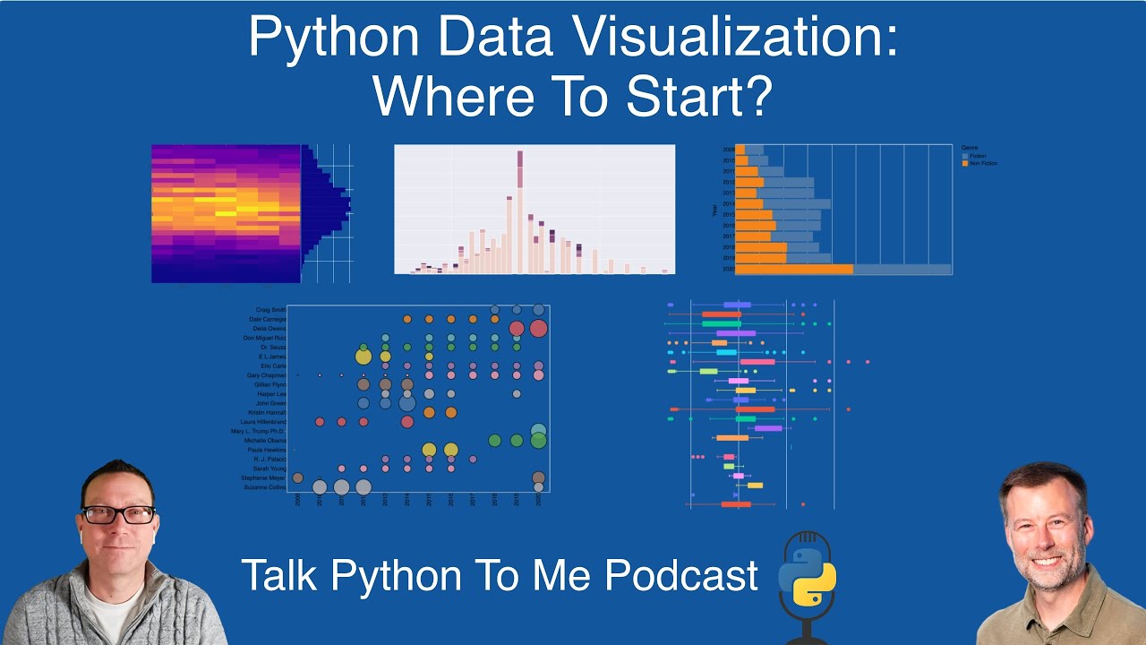
49:29 Yes.
49:29 Tell us what's going on in this picture.
49:30 And we can maybe talk through just the API components that make it happen.
49:34 Sure.
49:34 So behind the scenes, the data is, I can't even remember, well, I guess this one's through
49:39 2016 or so, 10 years or so of Amazon reviews.
49:44 So on the X axis, it's 2009 through 2020.
49:50 And then on the Y axis, we have authors.
49:52 So a lot of famous authors in this timeframe.
49:55 And some of these authors will have one book a year.
49:59 They'll have multiple books a year.
50:00 And so it will have a circle where for each author for the year they published the book
50:06 and the size of the circle represents how many reviews they had.
50:11 So this is a really quick way to see how consistent some of these top authors are over years.
50:17 You know, it's sort of interesting, like Dale Carnegie is at the top.
50:21 I mean, he wrote this book, I don't know, probably 50 plus years ago, but it's still a bestseller
50:27 on Amazon.
50:28 And then you have other people that are maybe a little more sporadic, but it's a very easy
50:35 way to see the consistency and then the number of reviews that each author gets for a year.
50:40 And I would say, you know, if an author has more than one book, obviously they'll have more
50:45 reviews.
50:46 So it's not broken out by book.
50:47 It's just purely by author.
50:48 Right.
50:48 And when you build up this picture, some of the things that happen is there's a legend that
50:52 shows up.
50:52 The legend is basically just a copy slightly offset of what's on the left.
50:56 But what you really want to know is what's the size of the circle means.
50:59 So you can add like an alternative legend and you can put a grid behind it and make it
51:04 really easy to follow the timeline.
51:06 There's just a really cool bunch of features.
51:08 And this is the kind of picture I was thinking about when we were thinking, when I said, you
51:13 know, like if you just go and call plot or circle or whatever, you know, mark circle, you
51:19 end up with something that's not all that impressive.
51:21 But if you layer a few of these ideas on, then it's great.
51:23 We said we've got the author in the year and then the size, we configure the size based
51:29 on the number of reviews.
51:30 Then we configure the color based on the author so that it's a little easy to follow the
51:34 little easier visually to look at this and see the information.
51:37 And then we also do this thing that is interesting with Altair is when you think about Seaborn
51:45 and Matplotlib and Pandas and some of the other libraries we'll talk about, you typically do
51:51 the data manipulation in Pandas.
51:53 Altair has its own ability to do manipulation and transformation of data.
51:59 And so there is this option, you know, I could have filtered it down to the top 20 customers
52:04 or authors, excuse me.
52:06 But I use this transform filter to select only the top authors.
52:12 And that's all in Altair, not using any Pandas.
52:16 And then the final thing that we do is configure the width and the height and the title.
52:21 So that's all, you know, kind of one long piece of code that looks intimidating as you, you know,
52:28 maybe if you haven't worked with Altair.
52:29 But when you take a step back and break it down and think about what it is you're trying
52:34 to do with your visualization.
52:35 And then with the basic understanding of the Altair API, it's pretty straightforward and extremely
52:41 powerful.
52:42 Sure.
52:42 You kind of got to do it in steps.
52:44 It's a very fluent API, you know, Alt.chart.markcircle.encode.configure.
52:51 But if you take each one of those relatively simple function calls, then you try to understand
52:57 that and see what you're doing.
52:58 And then it turns out to be not too bad.
52:59 Yeah, exactly.
53:00 And what people need to realize when they're thinking about this course is anytime I develop
53:06 code and it looks like this and it has this many lines, you're right.
53:08 It wasn't, I didn't start off.
53:10 I did first, let's just do author versus year.
53:12 I don't like this.
53:13 I need to tweak one more thing.
53:14 Then I need to tweak one more thing.
53:16 And you iterate over it to get there.
53:18 And once you kind of understand how all these libraries work, it's not too much work, but
53:24 it does take a little bit of time.
53:25 And that's why it's important to, you know, dive into the data and play with it and experiment
53:30 with it and see what works for you.
53:32 Yeah, it almost is its own little mini language.
53:34 It is.
53:36 It is.
53:36 All right.
53:37 Before we move on to the next one, question from the audience.
53:40 I'm all out there.
53:40 Can we do responsive and animated workflow diagrams with matplotlib?
53:44 For example, continuous builds development on different server or deployment on different
53:49 servers?
53:49 Not entirely sure exactly what you're asking, but certainly you can automate these things,
53:55 right?
53:55 It doesn't have to be in a notebook.
53:56 This could all be put into a script, right?
53:59 Yes.
53:59 And there are matplotlib does support some animation.
54:03 And I can't remember how much of this is out of the box matplotlib versus third party libraries.
54:09 But I've certainly seen visualizations that people have done with matplotlib where it's, you know,
54:13 something changing over time or steps in a process.
54:16 You can do that with matplotlib.
54:19 So you could create one of those language battles.
54:22 Have you ever seen those where like over 20 or 30 years, it's either a browser or the language
54:27 is when the book is popular, then it goes up.
54:29 And yeah.
54:29 Yes.
54:29 Yeah.
54:30 Yeah.
54:30 You could do that.
54:31 I'd have to look and see what would be the best approach, but those sorts of options are
54:36 out there.
54:36 Fun.
54:37 All right.
54:37 Sticking in the JavaScript side of things, the other really popular one over there is Plotly.
54:42 What's special and unique about Plotly?
54:44 I think Plotly is special and unique because it is a newer plotting library, kind of on the
54:52 order of Altair.
54:54 It is supported by a company out of Canada, but the Plotly visualization library is completely
55:04 open source.
55:04 It is based on JavaScript.
55:06 What I like about it is everything is interactive out of the box.
55:12 So any plot you make, as soon as it renders, you can take your mouse and you can hover over
55:17 it.
55:17 You can zoom in.
55:19 You can limit the range of data.
55:22 And so that is really powerful.
55:24 And then the second thing that I really like about it is the history of Plotly.
55:29 There was a separate Plotly visualization.
55:32 And then there was something called Plotly Express, which was streamlined.
55:36 And the Plotly Express API, in my opinion, is very similar to Seaborn.
55:42 And it is very, I think it's Pythonic.
55:45 It's very easy to understand and pick up.
55:47 And over time, they've expanded it to where now that's kind of the default visualization.
55:53 So it's very easy to get started with Plotly.
55:56 It makes those interactive plots out of the gate.
56:00 And then it does have some unique plots.
56:03 So some of the kind of custom tree map plots, scatter matrix.
56:07 You can do plotting on maps to show geographic plots.
56:12 Those are all like out of the box, work pretty well and are fairly simple to create.
56:20 Yeah.
56:20 The tree map and the sunburst, those come from Plotly, right?
56:23 Yes.
56:24 At least are in Plotly is one of those things.
56:27 And one of the other things that is interesting about Plotly, like any of these visualization
56:33 tools, you have to be able to go in and configure and customize and tweak things.
56:39 And Plotly gives you that ability to generate a plot, but then you can update it over time.
56:45 So you can change colors.
56:47 You can change the way data is presented.
56:49 You can change pretty much anything with the plot using a fairly simple API as well.
56:55 Yeah.
56:55 People should definitely go and check out the tree maps example.
56:59 One of the really cool interactions is, for example, the one that I'm looking at here has,
57:04 here's the world and then here's the different continents.
57:06 So like Asia, Africa, the Americas.
57:08 Then if you want to, within each one of those, they've got a little box that says, well, here's
57:14 how large of an impact, like for example, Nigeria and Egypt are, you know, have more people
57:20 in it, I guess, than the other countries.
57:22 And then they're colored by what their actual values are.
57:25 But if you want to just focus on say Africa, you can just click on that section of this
57:28 thing and it just zooms in to show you just that information.
57:32 And this, you're not going to get this with Matt Plotlet.
57:35 No.
57:35 Right?
57:36 No.
57:36 No, you're not.
57:37 And it's...
57:38 The ability to just dive in and out of the data.
57:39 Yeah, absolutely.
57:40 And it is very simple.
57:43 I use Plotly quite a bit, especially when I want to explore the data.
57:47 So you want to have a scatterplot or this tree map or any of the other visualizations and you
57:53 can easily filter or zoom in, zoom out.
57:57 And yeah.
57:58 So you're showing some of the other cool kind of unique visualizations that are out there
58:02 to Plotly that maybe aren't as available in some of the other libraries.
58:06 Yeah.
58:06 Yeah.
58:07 The Sunburst has a real similar...
58:09 The Sunburst is like a pie chart, but as you interact with it, it like zooms into those
58:13 sections in pretty amazing ways.
58:15 Yeah.
58:16 Well, that is pretty cool.
58:17 I haven't actually seen that one.
58:18 That's neat.
58:18 It's just like...
58:20 Yeah.
58:20 It just draws...
58:21 It just says, I want to explore this data, right?
58:24 Not only can I, but like, I'm going to.
58:26 Yes, exactly.
58:27 Yeah.
58:27 Cool.
58:28 Does Plotly have this idea of like a backend server like Altair?
58:31 Plotly, out of the box, no.
58:34 It's more, I guess, you know, I have to think behind the scenes, the actual architecture.
58:39 I don't know, but I do know that you don't have to necessarily worry about your data as
58:45 much and suddenly having a huge file that shows up in your notebook that you have to deal with
58:50 Altair.
58:50 Yeah.
58:51 Amazing.
58:51 This is good looking stuff.
58:52 Yes.
58:53 And really top marks on the animation and interactivity, sort of diving into the data,
58:58 right?
58:58 Yes.
58:59 Yep.
58:59 Cool.
59:00 All right.
59:00 So that's the building block libraries for the different options.
59:04 I know there's many other plotting libraries and, you know, we saw in our original graph
59:09 that there's a bunch here that we didn't touch on, but, you know, these are the ones that
59:12 you felt are most important right now.
59:14 Yeah.
59:14 Yeah.
59:15 You know, it's interesting.
59:16 I struggled a little bit with where to draw the line.
59:19 You know, what else, some of the other things I might want to bring in after I posted about
59:23 the course, I did get some feedback, you know, how come we didn't talk about a bouquet and
59:28 panel and hollow viz.
59:30 And, you know, I think the short and sweet answer was I had to draw the line somewhere.
59:36 I didn't have as much experience with those libraries, so I didn't dive into them.
59:40 They are also libraries that are kind of undergoing some, they've undergone changes in the past and
59:47 they, they are working to clean up their documentation, get the examples cleaned up.
59:52 So I think it's certainly worth considering those as well.
59:56 The other one that I would point out that is really interesting to me, but I haven't used
01:00:01 it, but I think a lot of your listeners might be interested in is a library called Plot9 that
01:00:07 is meant for people that have used ggplot from an R perspective.
01:00:11 And it's essentially like a direct port of that to Python.
01:00:15 So if you really like ggplot and miss it from R, then you can use Plot9 to replicate
01:00:22 that in Python and it uses a matplotlib behind the scenes.
01:00:27 And it's, I mean, it looks fascinating to me, especially for people that come from that
01:00:32 R background.
01:00:33 Sure.
01:00:33 That's something we haven't even touched on is like the influence of R and like the parallels
01:00:38 there.
01:00:39 And, and...
01:00:40 Yes.
01:00:40 Yes.
01:00:40 We probably want too much.
01:00:42 So we've got two more things to cover and these are...
01:00:45 How do I maybe run my code?
01:00:46 If I want to put it online and make it interactive and let other people interact with it.
01:00:50 Right?
01:00:50 So two of them, Streamlit and Plotly Dash.
01:00:54 Tell us about these.
01:00:55 Yes.
01:00:55 So, you know, everything we've talked about now there, especially with Plotly and Altair,
01:01:01 there is some degree of interactivity.
01:01:03 But when you want to build a dashboard or want to build more of like an application where
01:01:11 you can select and filter data, maybe have different visualizations, maybe have complex visualizations
01:01:17 like, like maps.
01:01:19 You need something more than just the out of the box Altair or Plotly.
01:01:24 And Streamlit is a very simple way to wrap a little bit of extra Python code around your
01:01:31 visualization and you get this interactive application for free.
01:01:36 And so like the demo you're showing right now is a great, you know, really powerful example
01:01:40 that shows Uber ride sharing in New York City.
01:01:44 It has sliders for you to choose what time the pickup happens.
01:01:48 And then it has these real time visualizations for different parts of the city about how
01:01:53 many pickups are happening.
01:01:55 And what's so cool about Streamlit is there is very little additional Python code you need
01:02:02 to do that.
01:02:03 So the workflow that I will typically do is I'll do my visualizations in Seaborn or Plotly
01:02:10 or Altair.
01:02:10 And then once I realize I need that next level, I can then just easily plop them into a separate
01:02:16 file with a couple lines of Streamlit code.
01:02:18 And boom, I've got an interactive application that I can run.
01:02:21 Yeah.
01:02:21 It's a really interesting way of programming.
01:02:25 You basically write a top to bottom procedural script that says, if I, in this case, what are
01:02:30 we, we're putting, we're putting the hour of a pickup, the hour of data you want to slice
01:02:35 and visualize.
01:02:36 And you said, well, if I could write a function that would make a graph given the hour, then
01:02:41 you just say, and make the web app.
01:02:42 You know what I mean?
01:02:43 And it gives you the interactive sliders for all the variables that go in.
01:02:47 And then you just, as the slider changes, it just recalls your functions.
01:02:51 And you don't have to know anything about web programming or AJAX or front end code.
01:02:56 And all of that just happens.
01:02:57 It's, it's pretty fantastic.
01:02:59 Streamlit was recently acquired, I think so recently, but within a year or two.
01:03:04 Yeah, they're acquired by Snowflake for a really large amount of money.
01:03:07 I know a lot of people are kind of scratching their head at that valuation, not to knock on
01:03:12 Streamlit.
01:03:13 I mean, congrats to them, but it's really interesting tool.
01:03:15 And it will be interesting to see what Snowflake does with them.
01:03:19 But you know, this tool right now is open source.
01:03:22 And I do think it is a very powerful, easy way to get a real web native interactive app with
01:03:29 very little code.
01:03:30 Yeah, absolutely.
01:03:31 Let's see.
01:03:32 Demetrius out there has a question, says, there are all these ways to make graphs quickly,
01:03:36 but I can't find anywhere on how, any information on how to make an interactive calendar with
01:03:42 events quickly.
01:03:43 Yeah, that's a good question.
01:03:45 I don't know.
01:03:46 Yeah, I don't know either.
01:03:47 Of any of these plots that have like a calendar function.
01:03:50 You don't possibly Streamlit.
01:03:52 It might.
01:03:53 Maybe.
01:03:53 It's interesting that you bring up Streamlit because Streamlit does have like third
01:03:57 party apps or plugins that you can incorporate.
01:04:01 that the individual opposed to that.
01:04:02 I definitely encourage them to take a look at Streamlit and see if there's something out
01:04:06 there.
01:04:06 So I interviewed, I believe it was Adrian.
01:04:10 Let me double check.
01:04:11 Yeah.
01:04:11 Adrian Truel back early days, early days of Streamlit.
01:04:16 I mean, we're talking two years ago before it was acquired about that.
01:04:19 So people can check that out.
01:04:21 And I'm somewhat familiar with that.
01:04:22 The other one, though, that's very fascinating that I don't know about is Dash.
01:04:27 How's that compared to Streamlit?
01:04:28 What's the, this comes from the Plotly company as well.
01:04:31 Yes.
01:04:32 So Plotly, like we mentioned, is a company.
01:04:35 They have Dash, which is a much more sophisticated and in-depth platform for developing interactive
01:04:45 applications or dashboards.
01:04:47 So whereas Streamlit is a little bit of code, Dash is much more of you kind of are embracing
01:04:55 HTML and CSS and you're doing callbacks and you have just a ton of flexibility in how you
01:05:04 structure your application.
01:05:05 And like this, this demo you're having here, you've got wind speed histograms and you've
01:05:10 got a line chart that's fully interactive and interactivity between the charts.
01:05:16 As you choose one, it influences another.
01:05:19 You can, Dash gives you flexibility to kind of manage the backend as well.
01:05:25 So you can run it.
01:05:27 I think it's, it's a Flask server, like on your system, you could do that.
01:05:31 But if you wanted to do an enterprise grade deployment, you could do that as well.
01:05:36 It's really, if you can think of it, Dash will probably let you do it.
01:05:40 And if you're a big enough company and it's mission critical, Dash does have that enterprise
01:05:45 support where you can pay a company to host it and support it for you.
01:05:50 You can build, if you, people should go look at the gallery for Plotly Dash.
01:05:54 There's a bunch of interesting things.
01:05:55 And one of the areas that stands out, I mean, you've got many, many different types of visualizations
01:06:01 and whatnot.
01:06:01 But one of the things that stands out for me is the streaming, streaming data aspect,
01:06:05 you know, create a dashboard where you hook it up to stock market data or IOT data and
01:06:12 it just goes, right?
01:06:13 Right.
01:06:14 Exactly.
01:06:15 It's designed to, you know, support a lot of data and low latency and all those kinds
01:06:22 of things.
01:06:22 So it's, it's really powerful, but this is one of those areas we talked about everything up
01:06:28 until now.
01:06:29 You don't really have to know a whole lot of Python.
01:06:31 Once you start getting into building Dash, it gets a little more complicated.
01:06:36 And I think that's where you want to make sure you've got a good solid Python foundation
01:06:41 before you go and build a dashboard to run your company.
01:06:45 Yeah.
01:06:45 But it's very powerful.
01:06:47 Very powerful.
01:06:47 Yeah.
01:06:48 The interactivity between the different elements is also quite interesting.
01:06:51 It is.
01:06:52 Yes.
01:06:52 And that's one of the, I mean, you can do that to some degree with Streamlit, but Dash just
01:06:58 makes, yeah, you can have a ton of interactivity between the different widgets and the different
01:07:04 visualizations.
01:07:05 Cool.
01:07:05 Well, it looks great.
01:07:06 If I had a dashboard that looked like this, I'd be proud of it.
01:07:09 It's not one of those things that's just like, oh, I guess I guess it works.
01:07:13 You know, no, it looks great.
01:07:14 Yeah.
01:07:14 I would be too.
01:07:15 Yeah.
01:07:16 Cool.
01:07:16 All right, Chris, we spent a lot of time on, on this.
01:07:19 I think we should probably button it up, but.
01:07:21 Yeah.
01:07:22 Bring it home.
01:07:22 A lot of great stuff.
01:07:23 Yeah.
01:07:24 A lot of great stuff in the visualization library space.
01:07:27 I think that's one of the really very powerful aspects of Python is it's just all of these
01:07:32 tools.
01:07:33 It's not the language.
01:07:34 It's not the standard library, which all those, they are important.
01:07:37 Like it's, people need to think this is sort of what people are talking about when they
01:07:41 say Python's awesome.
01:07:42 It's great to use.
01:07:43 It's not how it does a for loop.
01:07:45 It's that I can say, you know, dot Andrew's curve.
01:07:47 Yes.
01:07:48 Yeah.
01:07:49 And it all builds, right?
01:07:51 So if you're, you know, just starting on Python, then you start to build a little pandas
01:07:55 knowledge.
01:07:56 You don't have to throw that away and then focus on visualization.
01:07:58 It all builds on top of it and you can leverage all that knowledge and then all the other wonderful
01:08:04 libraries that are out there.
01:08:05 Absolutely.
01:08:05 All right.
01:08:06 Before you get out of here though, final two questions.
01:08:08 If you're going to write some Python code, what editor or editors do you use?
01:08:12 I'm pretty much a hundred percent VS Code now.
01:08:15 Right on.
01:08:15 Even over notebooks.
01:08:16 Yes.
01:08:17 Yes.
01:08:17 I've gotten to where I use the native VS Code notebooks and I really like that.
01:08:25 Like the comment divider type of style.
01:08:27 It's just, they, they have continued to update it so much that it just seems like it's a superior
01:08:34 approach for what I do and how I manage my environments right now.
01:08:38 Nice.
01:08:38 And then notable PyPI package or as.
01:08:41 Yeah.
01:08:42 I put two in here.
01:08:43 I don't have a ton of experience with them, but I wanted to call them out because I do
01:08:47 want to spend some time with it.
01:08:49 So the first one is Splink.
01:08:50 I wrote an article a couple of years back about doing data linkage or data duplication.
01:08:56 And so for, for those of you that aren't familiar, it could be a situation where let's say you
01:09:01 have your customer database and it's got Chris Moffitt lives at one, two, three main street
01:09:05 and you have a third party data set.
01:09:08 And it says, Mr. Moffitt lives at one, two, five main street and street is spelled a street.
01:09:14 How do you merge all that data together?
01:09:17 How do you do fuzzy matching?
01:09:19 And I played around with different options.
01:09:22 And this Splink is one that's actually came out of the UK from an individual that works
01:09:29 at the Ministry of Justice, which I think is just a cool name.
01:09:32 And he talks about using this to, to merge, you know, millions of records together.
01:09:38 And I think it's a kind of really interesting tool that is something that you can't really
01:09:44 do in Excel and it's a challenging problem.
01:09:46 And anytime someone's spent some time on that kind of problem, I think it's really interesting
01:09:51 and I want to spend some more time looking at that.
01:09:52 Yeah.
01:09:53 And they have on that GitHub repo, they got a couple of videos introducing it, which is great.
01:09:56 Yes.
01:09:57 And the other one.
01:09:58 Red frames.
01:09:59 So this is another one that I've seen come across my Twitter feed a couple of times.
01:10:04 I have not used it directly, but it is another library for manipulating data that's interoperable
01:10:12 with pandas, but gives a little bit more of that fluent API where you can kind of string
01:10:18 all these commands together to modify your data in ways that pandas supports a lot of this,
01:10:24 but there are certainly some things in pandas that are a little bit clunky.
01:10:27 And this looks like it's an attempt to try and bring some of that R goodness to Python.
01:10:33 Yeah.
01:10:34 It also looks a little bit like bringing SQL to it.
01:10:36 Yes.
01:10:37 Yeah.
01:10:37 Yeah.
01:10:37 Yeah.
01:10:37 Certainly there's.
01:10:38 A filter, a group, a sort, you know, change the names a little bit.
01:10:42 Yeah.
01:10:42 Filter away or sort order by, you know, it looks a little bit like SQL.
01:10:45 It just looks really interesting.
01:10:47 And like I said, I wanted to get some visibility to it and I haven't used it extensively, but
01:10:52 certainly want to play around with it a little bit more.
01:10:54 I thought your listeners might be interested.
01:10:56 Yeah.
01:10:56 It looks very cool.
01:10:57 Thanks for sharing that.
01:10:58 All right.
01:10:59 People are interested in Python data visualization.
01:11:02 They want to know more.
01:11:03 What do you tell them?
01:11:04 Hey, check out the course.
01:11:05 So really excited about the course.
01:11:08 If you've liked what you've listened to here, the course on Talk Python training has the examples,
01:11:15 the notebooks for you to go through and learn and play with this on your own.
01:11:18 And by the end of it, you should be at the point where you can start to apply it to your
01:11:22 own data.
01:11:22 So encourage you to check it out.
01:11:24 And if you do check it out, let me know.
01:11:25 Be interested to see what you think.
01:11:26 Yeah.
01:11:27 It definitely covers all of this in hands-on detail, not just conceptually.
01:11:31 So yeah.
01:11:32 Thanks for being here, Chris.
01:11:33 Thanks for sharing your experience.
01:11:35 And yeah.
01:11:36 Happy to have you back on the show.
01:11:37 Thank you.
01:11:38 Great discussion.
01:11:38 Yeah, you bet.
01:11:39 Bye-bye.
01:11:39 Bye.
01:11:40 This has been another episode of Talk Python To Me.
01:11:44 Thank you to our sponsors.
01:11:45 Be sure to check out what they're offering.
01:11:47 It really helps support the show.
01:11:48 Starting a business is hard.
01:11:50 Microsoft for Startups, Founders Hub provides all founders at any stage with free resources
01:11:57 and connections to solve startup challenges.
01:11:59 Apply for free today at talkpython.fm/founders hub.
01:12:04 Want to level up your Python?
01:12:06 We have one of the largest catalogs of Python video courses over at Talk Python.
01:12:10 Our content ranges from true beginners to deeply advanced topics like memory and async.
01:12:15 And best of all, there's not a subscription in sight.
01:12:18 Check it out for yourself at training.talkpython.fm.
01:12:21 Be sure to subscribe to the show.
01:12:22 Open your favorite podcast app and search for Python.
01:12:25 We should be right at the top.
01:12:27 You can also find the iTunes feed at /itunes, the Google Play feed at /play,
01:12:32 and the direct RSS feed at /rss on talkpython.fm.
01:12:36 We're live streaming most of our recordings these days.
01:12:39 If you want to be part of the show and have your comments featured on the air,
01:12:43 be sure to subscribe to our YouTube channel at talkpython.fm/youtube.
01:12:48 This is your host, Michael Kennedy.
01:12:49 Thanks so much for listening.
01:12:50 I really appreciate it.
01:12:51 Now get out there and write some Python code.
01:12:53 I'll see you next time.
01:13:14 Thank you.